If you’ve been paying attention, you may have noticed that design, kitchen design in particular, has been shifting from stark whites to tonal, more natural whites. With respect to design in general, this trend towards more nature-inspired tones has given a rebirth to color. A bit less of the grays, beiges, and taupes and more saturated COLOR. A subset within this interior design trend of more color is another trend we, as designers, are getting more requests for: Color Drenching. This trend does not seem to be going away anytime soon.
What is Color Drenching?
Color Drenching involves going all-in on a particular hue. This interior design technique involves immersing every surface with a single color — the walls, cabinets, trim, doors, moldings, ceiling, baseboards, built-ins, and sometimes even the floor, if it makes sense.

This color drenched walk-in pantry was designed by Honeycomb Home Design of Arroyo Grande, California, featuring Dura Supreme Cabinetry in the Reese skinny shaker door style with a Personal Paint Match finish to Benjamin Moore’s “Tate Olive” HC-112 paint color. Photography by Lisa Maksoudian.
This approach can elevate a room, creating a more luxurious and impactful space. All of the parts and pieces that were previously left white (baseboards, white subway tile, moldings, and ceilings) are now enveloped in the paint scheme.
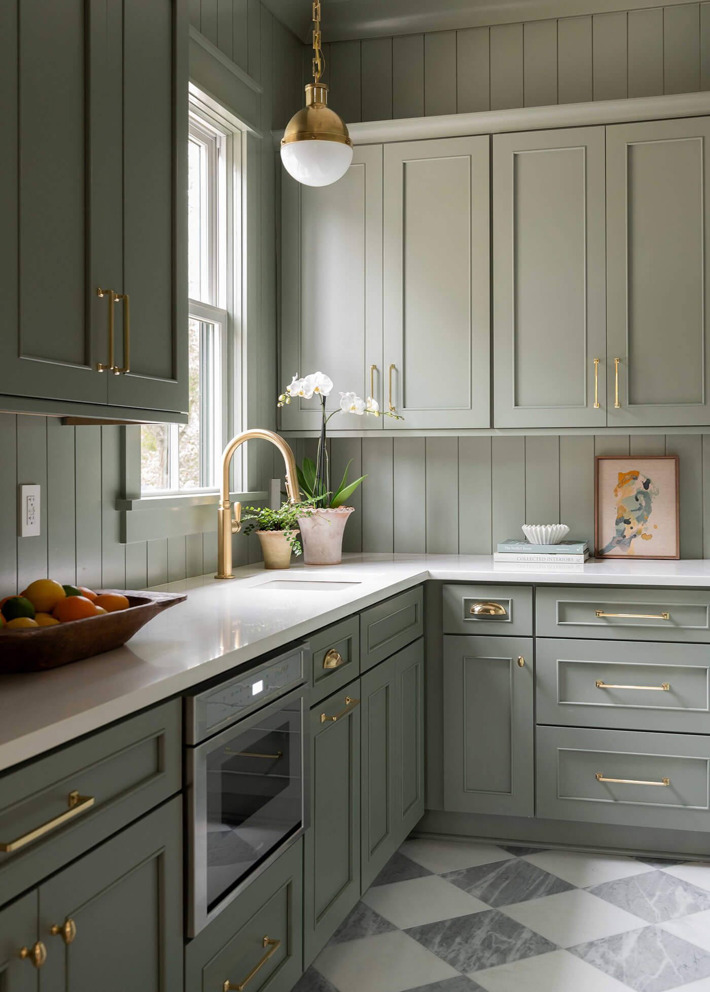
Lighter colors can be used to brighten a space and give a sophisticated, calm vibe…
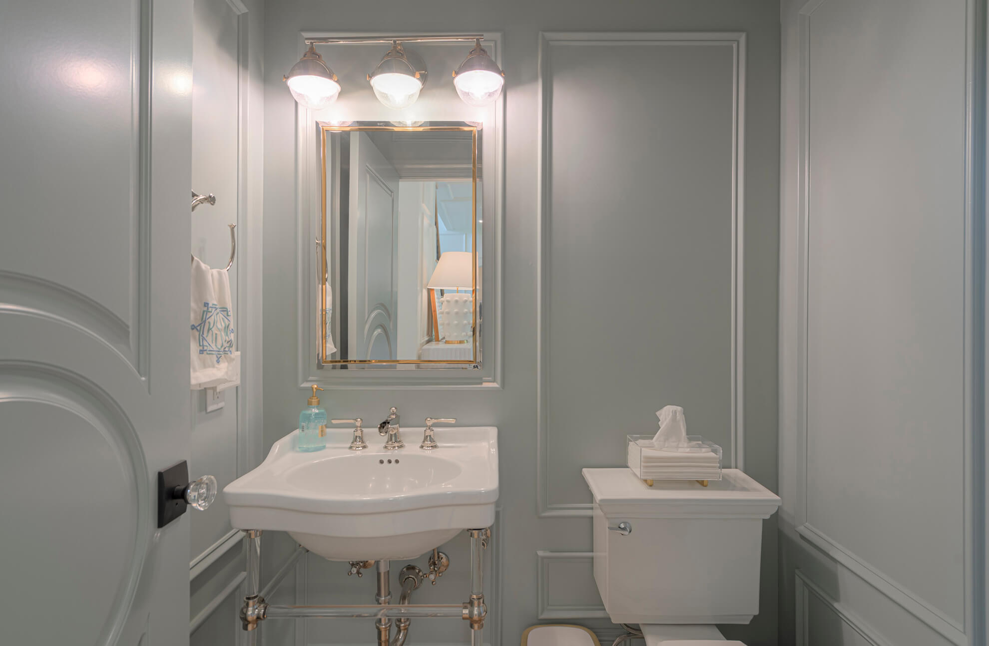
This beautiful color drenched bathroom was designed by Slate Creek Builders of Blacksburg, Virginia.
… or deeper hues can be used to create moodiness and drama.
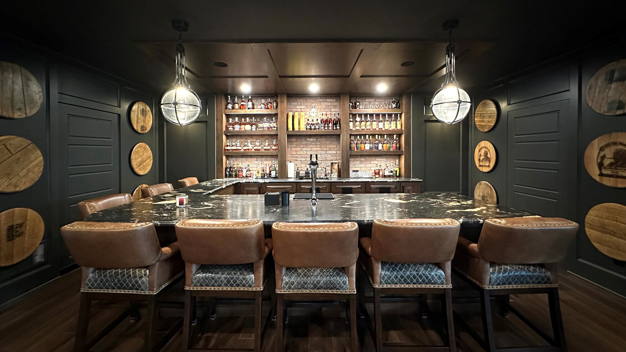
This color drenched home bar design uses Dura Supreme’s Lancaster door style in the “Mocha” stain on Hickory, surrounded by Black painted walls, paneling, ceiling, and countertops. Designed by Aaron Mauk of Mauk Cabinets by Design of Tipp City, Ohio.
Think of a spa-like bathroom drenched in an icy light blue or a library space enveloping the owner in a rich dark green. Both are beautiful but with very different intentions.
Important Things to Consider When Designing a Color Drenched Room
1. Lighting
Are there lots of windows providing natural light? Sconces for ambient lighting? Task lighting? Chandeliers? The type of lighting that is chosen will help determine the finish type– matte, glossy, etc. Sometimes, a room will have the same exact color on various surfaces, but done in glossy for one area (in tile) and matte for another area (in cabinets).
Interior design and construction by Harjo Construction of Seattle, Washington, featuring Dura Supreme Cabinetry’s Craftsman Panel door style in “Gale Force” paint. Photography by M. Romney Photography.
Perhaps the ceiling is in a glossy paint finish to better reflect a chandelier’s lighting throughout the room, or matte-finished bookshelves adjacent to sconce lighting to limit eye glare while perusing book titles.
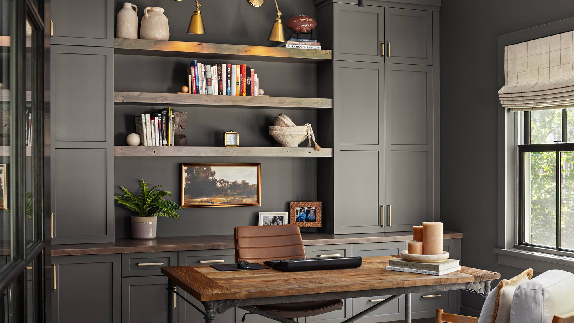
This color drenched home office is sure to create an environment that enhances focus and creativity. The cabinetry features Dura Supreme’s Hudson shaker door style in the “Cast Iron” paint color. Design by Boyer Building Corporation of Minnetonka, Minnesota and photography by Landmark Photography.
2. Contrasting Decor and Furniture
A little relief from the color drench can really make a sofa, a metallic accent, a piece of art, a kitchen island, etc., pop. Here is an example below of this concept, beautifully done, with pops of royal blue and pale pink.

This neutral color drenched home office was designed by Rebekah Moore Murphy, Founder of Stone Hall Cabinetry of St. Louis, Missouri. The built-in bookcases and cabinetry feature Dura Supreme Cabinetry with a Personal Paint Match finish to Sherwin-Williams “Ironclad” SW9570 gray paint color.
Dura Supreme Cabinetry is perfectly positioned to embrace this defining trend. With our Personal Paint Match program or our Custom Finish Program, we can match any paint color imaginable. There are no limits. The homeowner is truly getting a one-of-a-kind design.
This stunning color drenched Butler’s Pantry features Dura Supreme Cabinetry’s Silverton flat panel door style in the “Evergreen Fog” paint color. Design by Jessica Hamilton of Arc Interiors of Charleston, South Carolina. Photography by Nick Cann Photography.
By choosing a color that is meaningful to you, you can thoughtfully consider the available lighting and create an unforgettable room that embodies this red-hot Color Drenching trend. Talk to your local Dura Supreme designer to discover how you can bring this exciting look into your home.