If you haven’t already heard, Pantone announced their Color of the Year for 2026 to be a soft, off-white color called Cloud Dancer 11-4201. This trendsetting, lofty white tone sends whispers of tranquility and peace into a busy, noisy world.

Image courtesy of Pantone
Who is Pantone?
Pantone is a leader in color selection, providing the universal language of color, enabling over 10 million designers and manufacturers worldwide to define, communicate, and control color across industries—from graphics and fashion to product design.
Why Cloud Dancer?
“At this time of transformation, when we are reimagining our future and our place in the world, PANTONE 11-4201 Cloud Dancer is a discrete white hue offering a promise of clarity,” says Leatrice Eiseman, Executive Director of the Pantone Color Institute. “The cacophony that surrounds us has become overwhelming, making it harder to hear the voices of our inner selves. A conscious statement of simplification, Cloud Dancer enhances our focus, providing release from the distraction of external influences.”
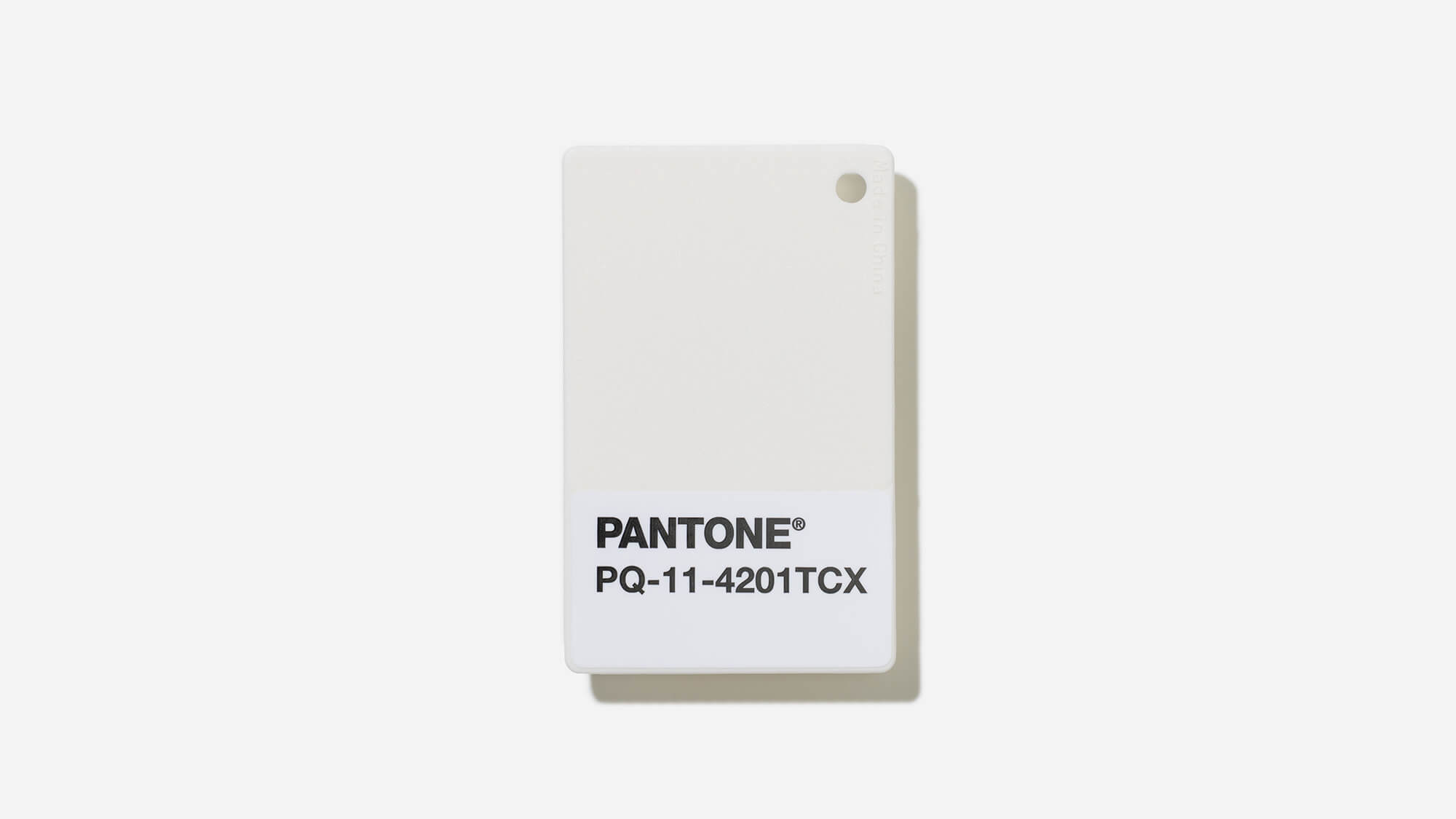
Image courtesy of Pantone
“We are living in a transitional time where people are seeking truth, possibility, and a new way of living,” added Laurie. “PANTONE 11-4201 Cloud Dancer is an airy white hue that exemplifies our search for balance between our digital future and our primal need for human connection—a liminal space that is a launchpad for creative expression—as individuals and communities are experimenting beyond traditional boundaries, opening the door to increased imagination and innovation.”
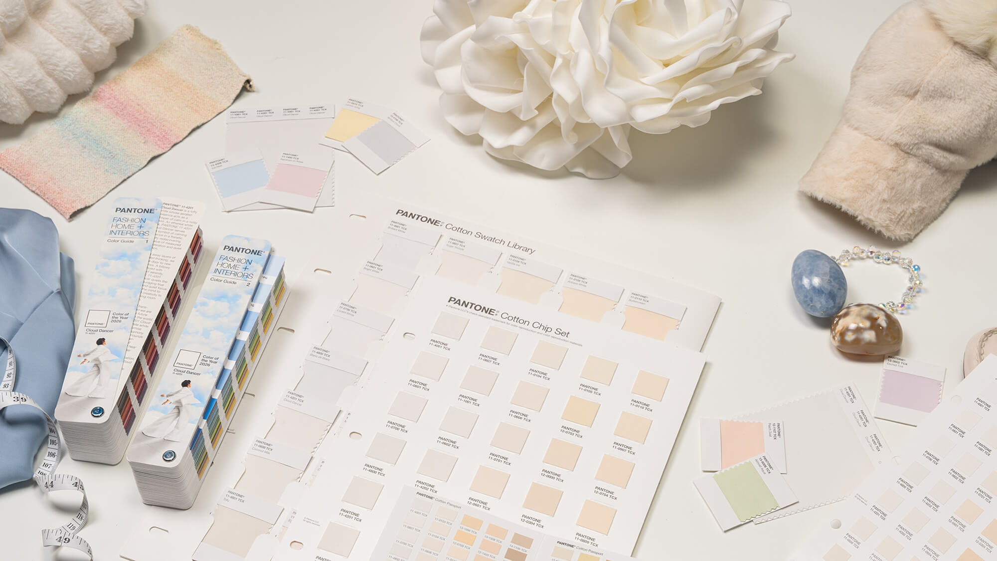
Image courtesy of Pantone
How Did a White Color Become Pantone Color of the Year?
Pantone’s latest color of the year announcement, many are asking, “Why would Pantone choose a white for Color of the Year?” But I believe it is a strong statement that the company is trying to make: the off-white trend has officially returned. Unlike the yellowed, antiqued look of off-whites that were tremendously popular in the 1980s, off-whites have been revitalized with a modern new take. Today’s trendsetting off-white hues, like Cloud Dancer, embrace more tonal, soft, off-white hues inspired by nature. They feel fresh and new and not aged or antiqued. They also add more dynamic to the color palette than a stark, bright white, which has been at the forefront of trends now for years. Homeowners are now seeking white hues with more personality.

Off-White of the 1980s. Photo scanned from a 1985 Dura Supreme brochure.
Today’s Off-Whites.
Dura Supreme captures this color trend perfectly with leading paint finishes like Putty, Dove, Mushroom, Canvas, Pearl, Silver Mist, and Linen White—each drawing inspiration from natural materials and earthy tones.

Dura Supreme Cabinetry’s collection of Soft, Tonal Off-White paint colors for cabinets that are inspired by nature.
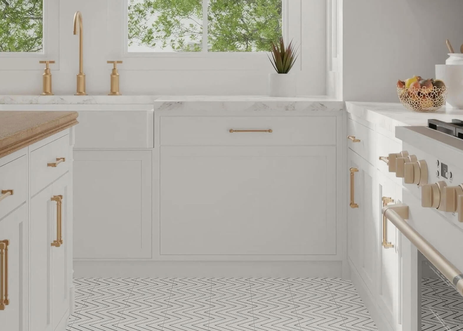
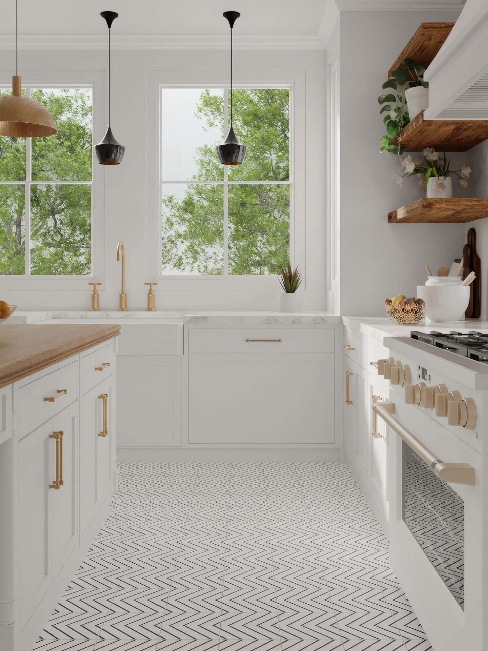
How can I incorporate Cloud Dancer into my kitchen design?
Cloud Dancer 11-4201 creates a stunning canvas for any interior design. Its ability to be a key structural hue, whose versatility provides the structure for the entire color spectrum, allows all colors to shine when paired with it. To create a kitchen design with Cloud Dancer, let the color become the backdrop to your space by selecting it for larger elements like walls, the countertops, the cabinetry or the backsplash, curtains, etc. allowing the color to emphasize the design. Letting Cloud Dancer create a calming mood to a room by infusing it with an inviting feeling of serenity, spaciousness, and well-being.
How Can I Use Cloud Dancer with My Cabinetry?
There are several ways you can incorporate this color into your cabinetry. If you’re a fashion-forward individual and you’d like your cabinetry to perfectly match a specific Pantone color, like Cloud Dancer, Dura Supreme’s Custom Finish Program will help you accomplish this beautifully. Simply specify the Pantone color sample and our finish experts will match it!
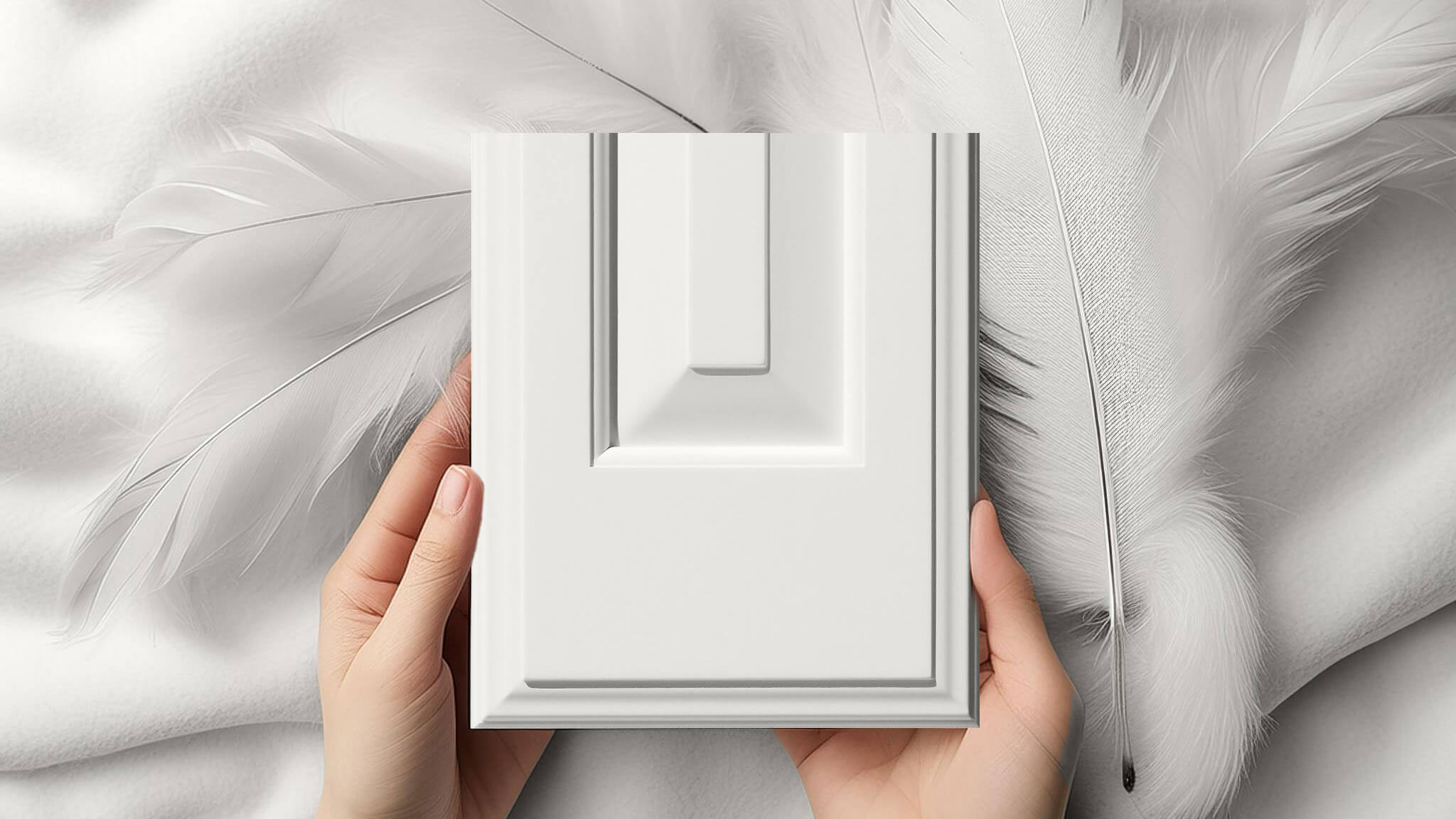
Featuring the Bella door style on a drawer front in a Custom Match Finish to Pantone’s Cloud Dancer 11-4201.
You can also use Dura Supreme’s Personal Paint Match Program, which utilizes the entire Sherwin-Williams color palette (and the entire Benjamin Moore paint palette). If you need help translating a Pantone to a matching Sherwin-Williams color, try using one of Sherwin-Williams Color Tools. They have several mobile, tablet, and desktop apps that will help you explore and find the right paint color. My favorite tool is Sherwin-Williams Paint Color Visualizer Match a Photo feature.
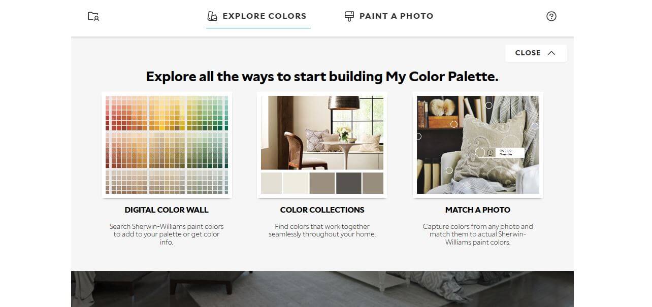
Once opening their Color Visualizer on their website, choose “Explore Colors” and “Match a Photo” and upload a photo of the pantone color or other color you’d like to find a similar Sherwin-Willimas color for.

Image courtesy of Pantone
The tool will then identify Sherwin-Williams colors that best match the image. As you can see in the image above, it suggests Sherwin-Williams’ colors Ghosted SW 9545 and Ice Cube SW 6252 as the closest matches to Pantone Cloud Dancer 11-4201.

Dura Supreme’s Carson V-Groove Inset door style shown in a Personal Paint Match finish to Sherwin-Williams Ghosted SW 9545.
Is Cloud Dancer Your Color?
How will you use Cloud Dancer in your interior design? If you are interested in adding the look of Cloud Dancer to your kitchen design, contact your local Dura Supreme Showroom to learn more.