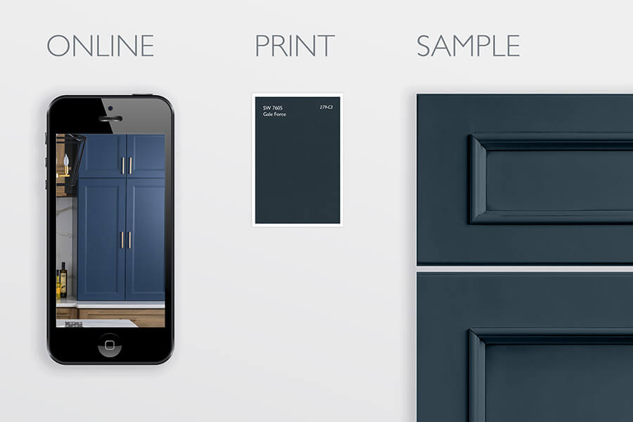
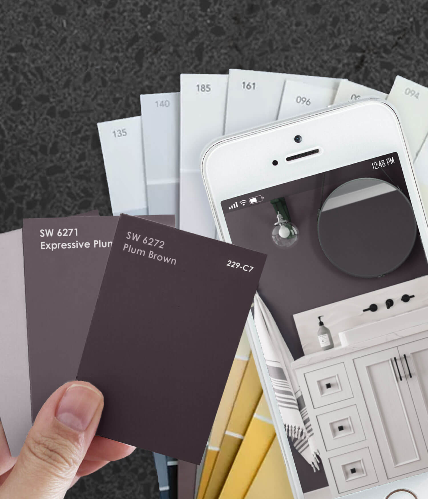
Can you really pick out your paint or finish color from a photo found online or printed in a magazine? The answer is… Not entirely. Getting your initial direction and inspiration for your interior design colors, styles, and textures from photos viewed online or printed is a great place to start. However, you should never make a final decision without viewing a sample in person, especially if it’s a large, long-term feature like cabinetry.
Using photos is an excellent way to narrow down your search but if you don’t see a sample in person, you’re taking a risk. This might not be such a big deal if you’re purchasing a sweater online and it comes in a different shade or hue than expected, but it’s a big deal if you’re purchasing an entire kitchen. In this article, we will discuss the science behind how online and printed photos can play color tricks on us and best practices to ensure you’re selecting the right colors for your interior design.
Viewing Colors on a Screen VS. In-Person
Managing Dura Supreme’s social media, I’ve had many conversations over the years with homeowners where we find that the screen they are using has altered the color of an image.
For example, I spoke with a woman who saw a photo of a Dura Supreme bathroom and loved the wall color. I provided her with the manufacturer’s name and the paint color that was used on the walls. She was so excited. She went straight to the store, purchased the paint, brought it home, opened it up, and was shocked. It was BLUE! She thought she was purchasing a PURPLE paint.
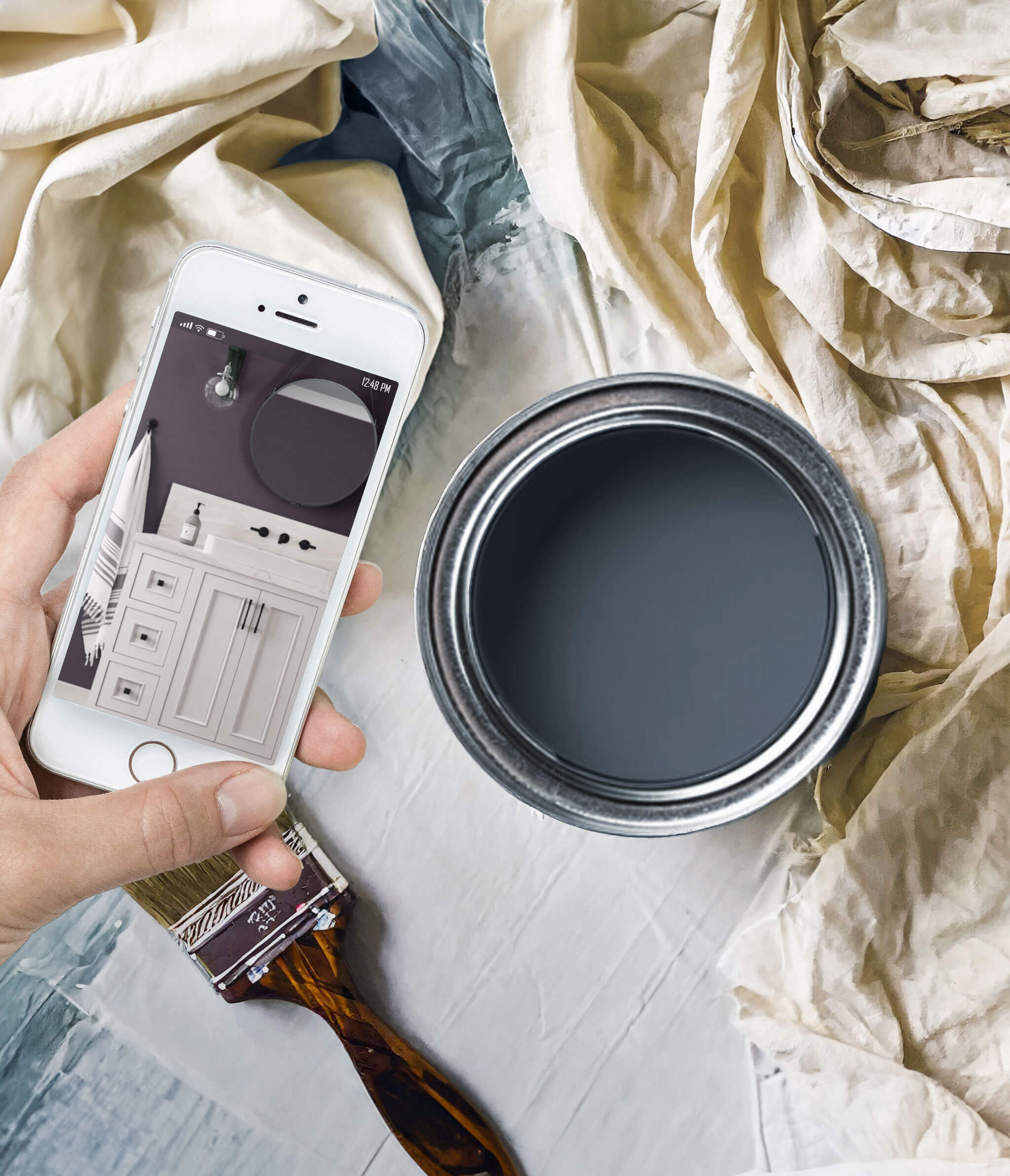
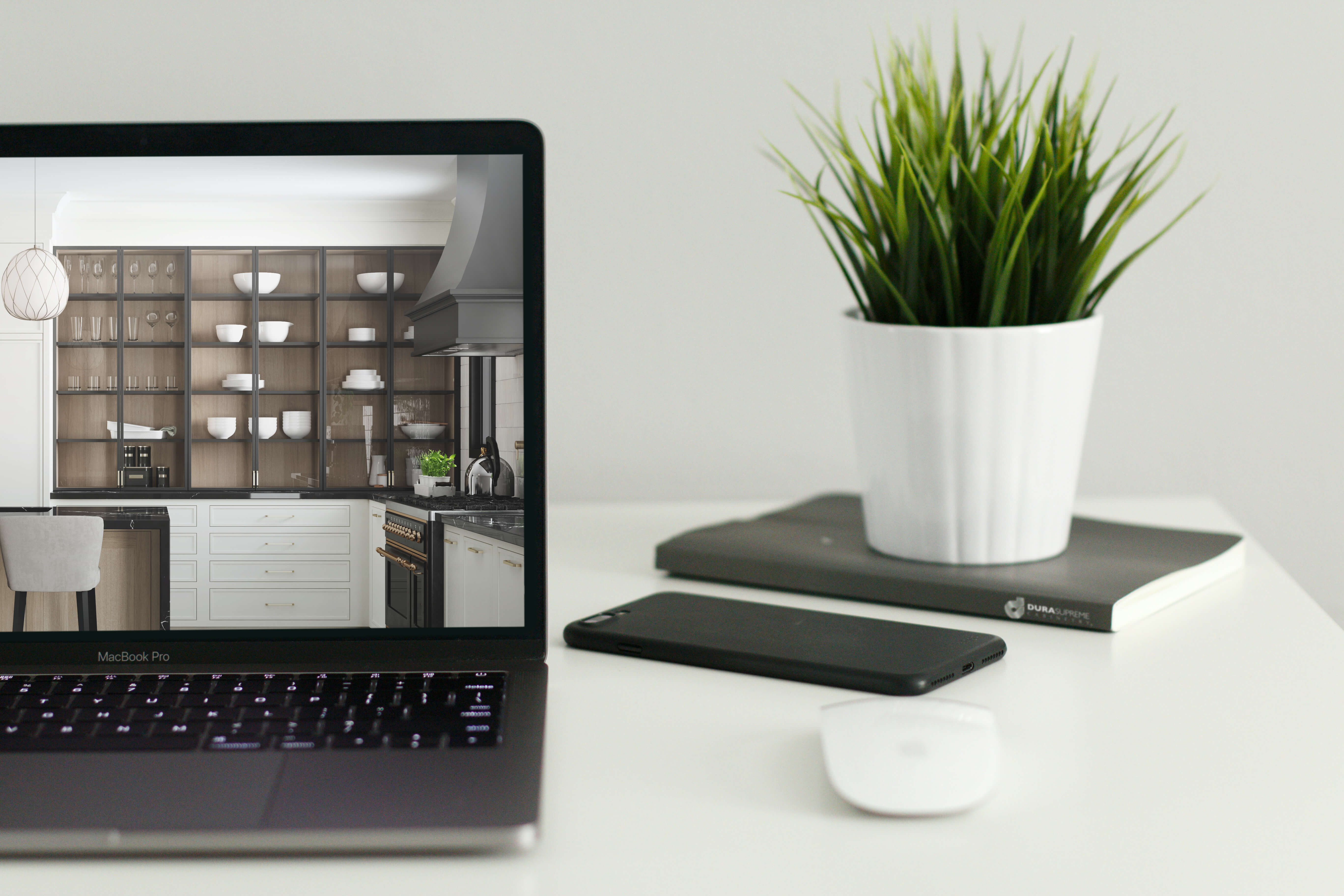
Unfortunately, she did not take the time at the store to check the samples of that color before she ordered and purchased it. She called my office, certain that I had given her the wrong paint color name. I did some research to double-check. I could see the photo had blue walls on my computer screen and my mobile screen. Also, I had seen this space in person and remembered it was a blue paint. Next, I checked the receipts of the job, and sure enough, the color I had given her was correct and it was blue. On her phone, it was clearly purple. I had her pull up the same image on her desktop computer and there she could see that it was blue.
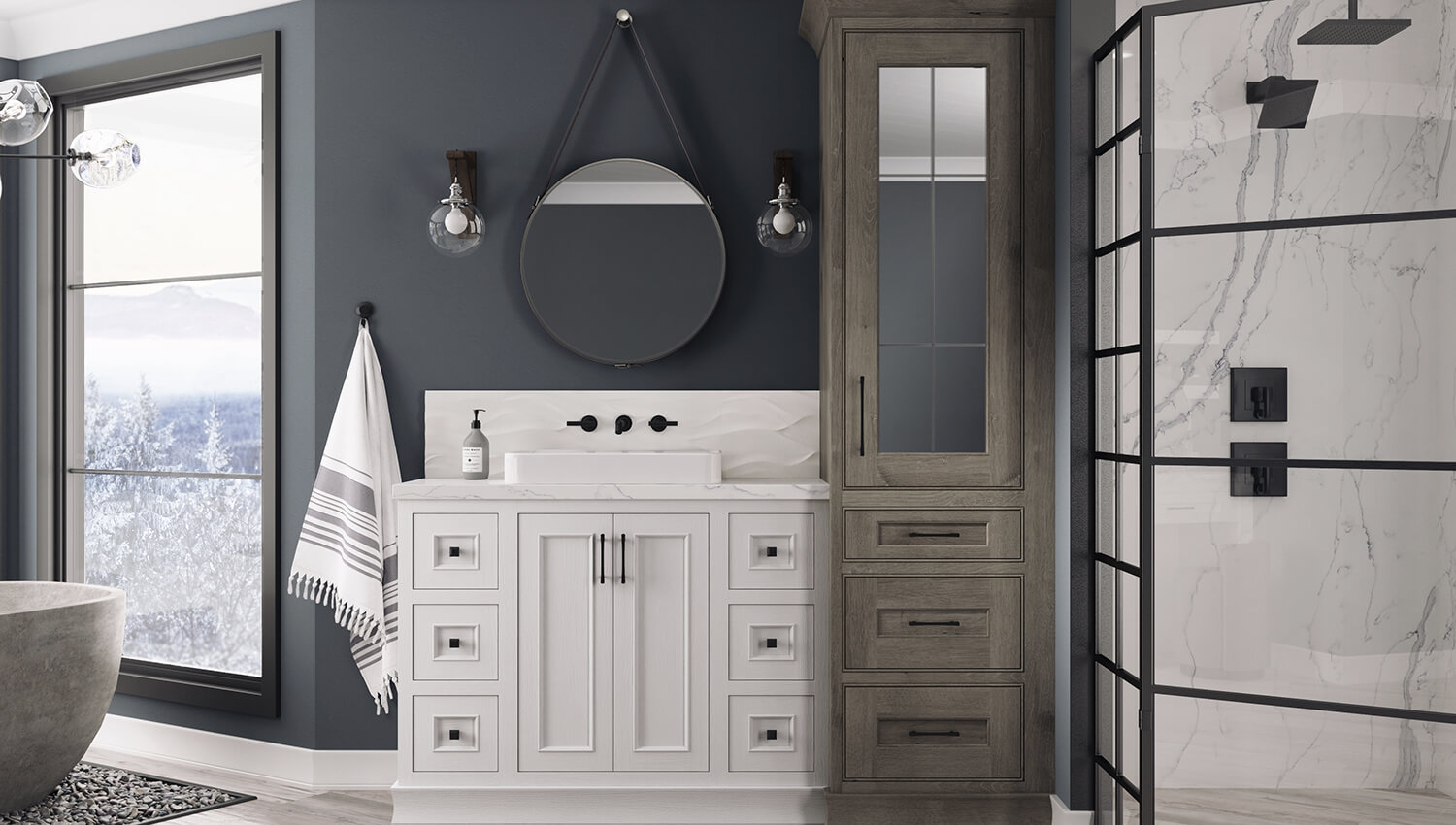
Example original picture with Sherwin-Williams blue paint called “Granite Peak” SW 62050 with a Dura Supreme vanity in “White” paint on painted oak.
Since she had her heart set on the purple she viewed on her phone, I advised her to go back to the store and select a purple paint that best matched what she saw on her screen instead. She was able to locate the color she was looking for.
So why did this happen?
I can tell you 2 big reasons this likely happened. The conversion of RYB to RGB and/or her Mobile Device Display Settings or Color Mixing Method.
Primary Color Conversion – RGB VS. RYB
So how can screens & monitors distort color? Different objects reflect different kinds of colors. When we view an object in person, we detect the color from the light that is bounced off of the object. With computers, TVs, and mobile devices, the screens produce a light that projects and mixes Red, Green, or Blue (RGB) rays of light to create all the colors of the rainbow. But wait, didn’t we all learn in school that color is made up of the primary colors Red, Yellow, and Blue (RYB)? That’s because when we view a physical object, like paint, we see a mixture of Red, Blue, and Yellow reflected color, much different than the primary colors of light (RGB).
For example, if a cabinet finish is viewed in person, we detect the color by the light bouncing off the finish. When viewing that same finish on a phone screen, the color is created by a projected light.
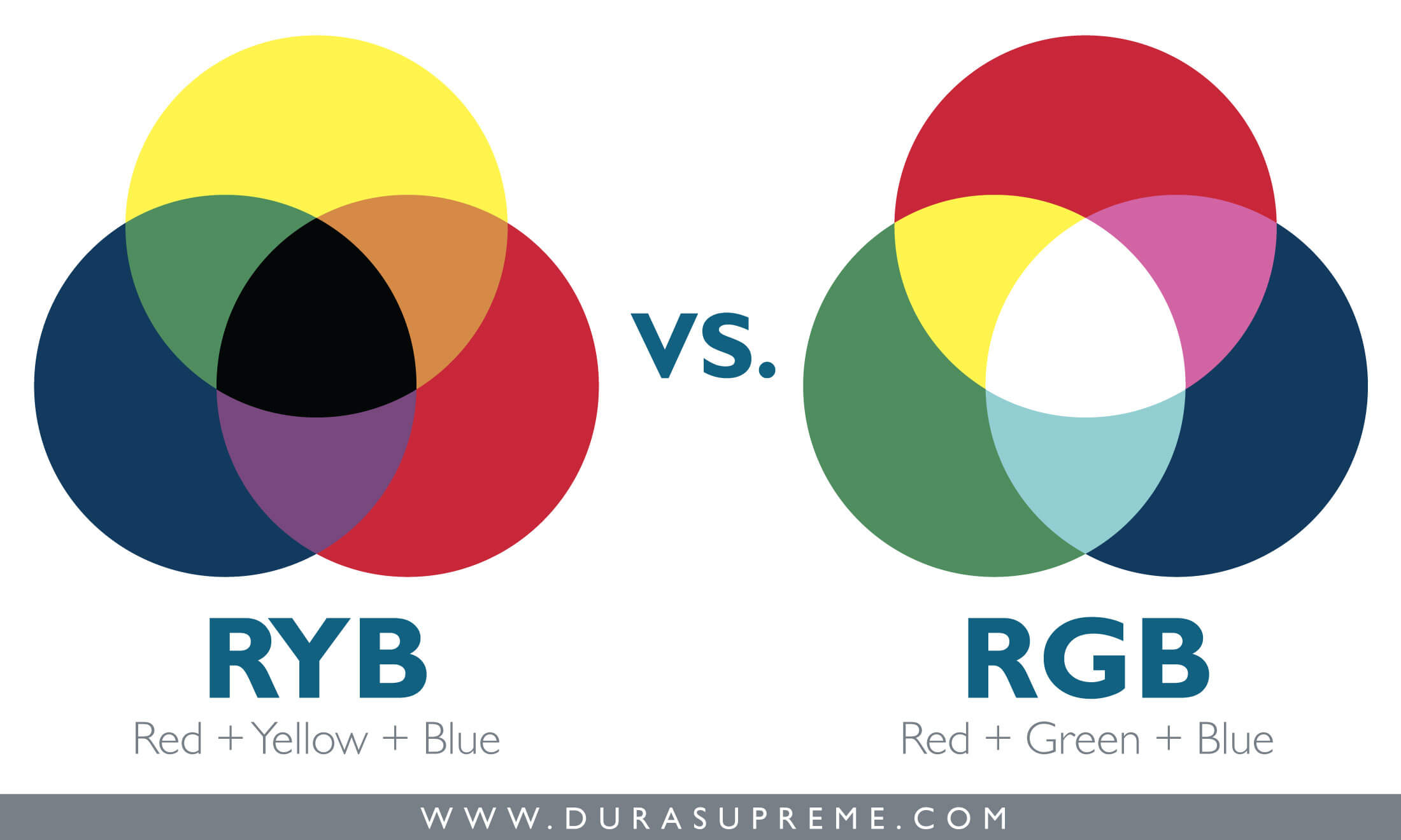
Screens project light mixing RGB colors while physical paints and stains are created by mixing RYB pigment colors.
Different Screens Have Different Color Mixing Methods & Settings
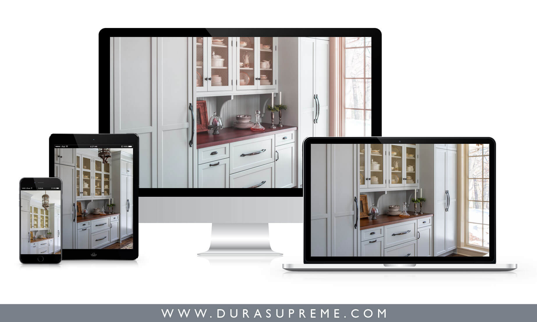
It’s important to note that devices with screens (TVs, phones, computers, tablets, smartwatches, etc.) can have their color settings altered by the manufacturer, the retail store, or the owner. Something that is rarely talked about is that different devices can also have different methods for mixing and projecting colors, depending on how the device was built. Because of these factors, you can view the same picture on your TV, on your phone, on a tablet, and then on your computer and it will look slightly different on each device.
Viewing Colors in a Printed Photo VS. In-Person
Printed photos in magazines, brochures, etc. are produced with ink to produce the color. Printed materials are created with four primary colors called CYMK (Cyan, Magenta, Yellow, and Black). The combination of these 4 colors help printers produce the full spectrum of color. As I mentioned earlier, with a physical object our eyes see a reflection produced of RYB (Red, Yellow, Blue).

In short, we are seeing a color that’s been converted, not actually seeing the natural color. Although manufacturers like us do our best to color correct and ensure the colors are printed as accurately as possible, there is still an uncontrollable conversion that happens that we cannot avoid which is why colors will vary from one media to the next. Another solid reason why it’s best to see a sample in person.
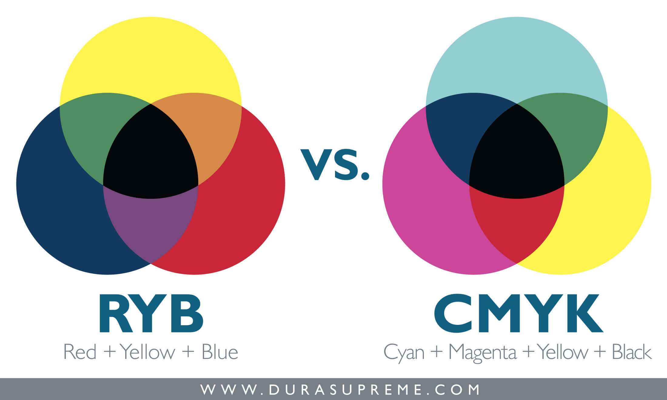
Printed products mix CMYK ink colors while physical paints and stains are created by mixing RYB pigment colors.
View Samples In Person and Work with a Designer
No matter if a photo is printed on paper or shown on a screen, there is a natural conversion of color that takes place. It’s always best to view a sample of a finish in person (i.e. cabinet stain or paint, wall paint, tile, countertop material, etc.).
Viewing physical samples in person helps you accurately gauge the color of the finish you’re selecting. To be even more sure of your finish selection we recommend viewing it in the actual space where the cabinetry will be placed, when that’s an option.
If you’re seeking a specific color for your cabinetry and want to ensure you’re choosing the right hue, stop by your local Dura Supreme Showroom to view samples in person. Your local showroom will have the full collection of Dura Supreme’s standard finishes and door styles for you to view, touch, and feel in person so you can truly gauge the color and look of the product before making a final decision.
Learn more about best practices for selecting colors for your home from our Making Selections Guide.
Check out the other blogs in this series about color tricks:
- Part 1: Don’t be Fooled by Color Tricks! Discover What Not to Do When Choosing Interior Design Colors
- Part 2: Color Tricks: Online & Printed Photos Never Compare to the Real Thing
- Part 3: Color Tricks: Ambient Light is Messing with My Color Choice
- Part 4: Color Tricks: What is Color Constancy Confusion?

